Article
The InterScreen Concept
The aim is to develop a concept for an interactive information screen for various public environments such as universities, train stations and shopping malls that meets the users needs.
Analysis overview
At the beginning there were no limits regarding the organizational and technical context, but the team wanted to develop a feasible and accessible concept. (I was the leader of a team of four and responsible for all digital prototypes.)
Where is the system used?
- public facilities with highly frequented areas (since the concept was a university project, sample applications and german terms are used in this context)
What is the purpose?
- users receive quickly the most important or most interesting informations as they pass
- users are able to perform their tasks through interaction
What are the key conditions?
- accessibility
- privacy protection
User research
The target group consists of visitors of a certain public environment who are looking for location-specific information.
Students and university staff participated in Interviews without an comparable system at hand.
On a "walk up and use system" (information screen in a train station) was a covered observation with non-participating users conducted.
Task and problem analysis
Personas, scenarios and user stories were created for a better understanding of the users problems and their tasks.
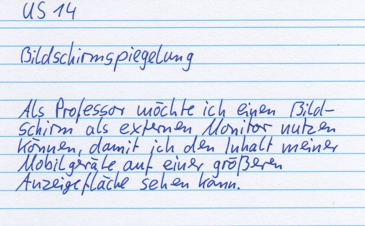
Example (figure 1): Screen mirroring - As a professor, I want to be able to use a screen as an external monitor so that I can see the content of my mobile devices enlarged.
Requirements
The following requirements illustrate an excerpt from the product backlog:
- the view at the most important informations is never blocked - this means that a user cannot block this particular area while interacting with the InterScreen.
- users can interact with the InterScreen regardless of their body height - for instance children and wheelchair users
- the user interface is limited to the users area of perception - there for elements can not be overlooked
- graphical user interface with multi-touch input - no voice or gesture control because of the noisy and turbulent surroundings
The concept
The vision was illustrated with a storyboard and showed a modular hardware and software design which enables a single and multiple screen setup. Each screen can serve one specific or several purposes. The InterScreen could be a 70 till 75 inch multi-touch display mounted in the portrait format.
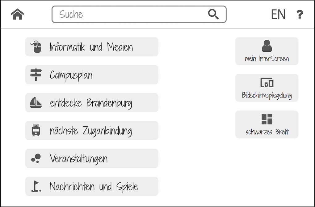
The most common setup would consist out of a dedicated presentation area on top of the screen and a variable area below. The variable area functions just like a common walk up and use system. That means it provides a home screen which can be manipulated by the user. If no user interface is needed at a given time the variable area can also show informations in addition to the top area.
Information architecture
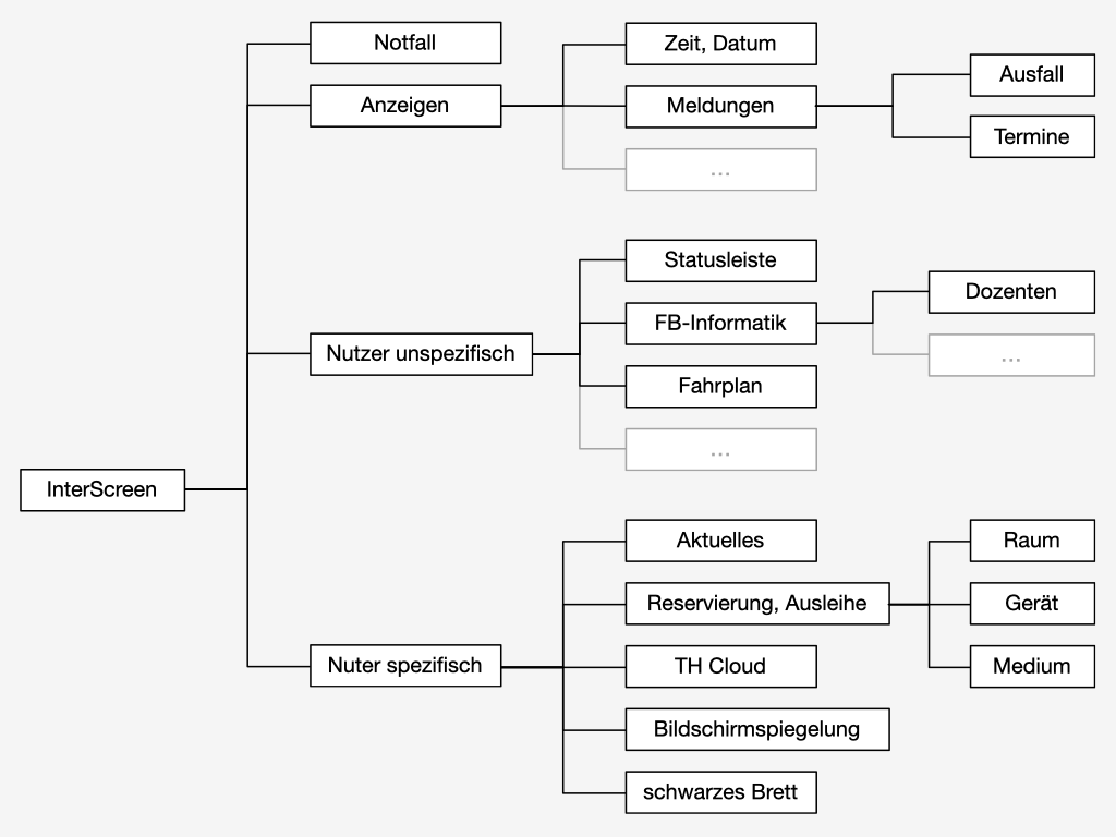
At first there was a high-level sitemap created to define the taxonomy by grouping the related content. In the process the sitemap became more and more detailed.
The following four top-level components are (figure 2):
- emergency alert
- presentation field (e.g. announcements, general information, advertisement)
- user interface for location-specific informations
- user interface for logged-in users
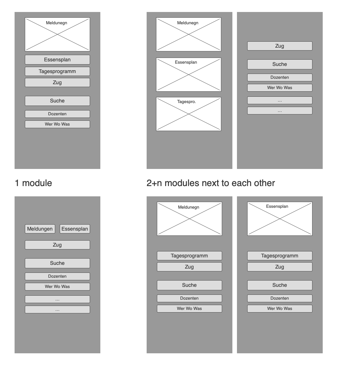
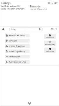
Several different wireframes were created to determine the structure and allocation of the components (figure 3).
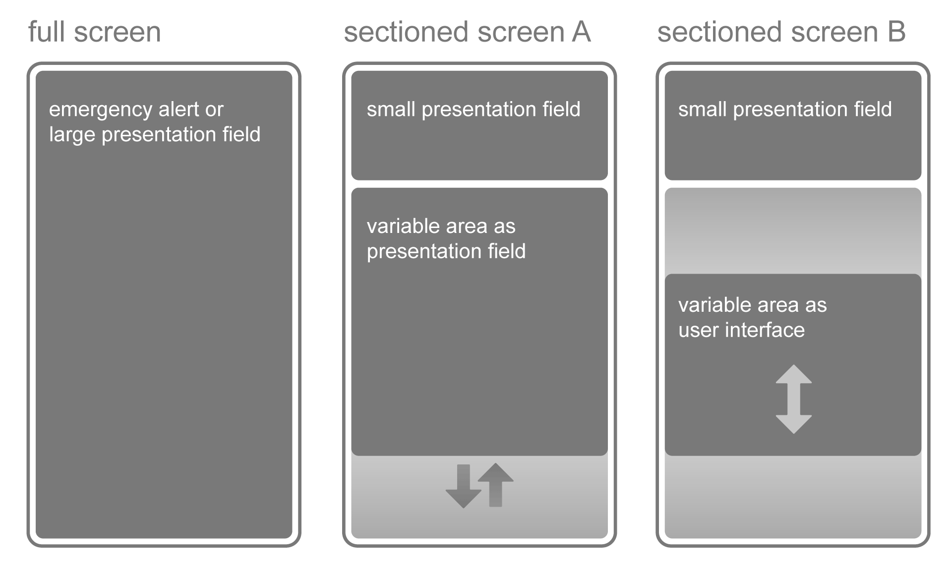
The following final structure respectively allocation were determined (figure 4):
- full screen for emergency alerts or as presentation field
- sectioned screen with a top quarter area as presentation field and a variable area below
- the variable area can be a additional presentation field (sectioned screen A) or an user interface (sectioned screen B)
Technical concept
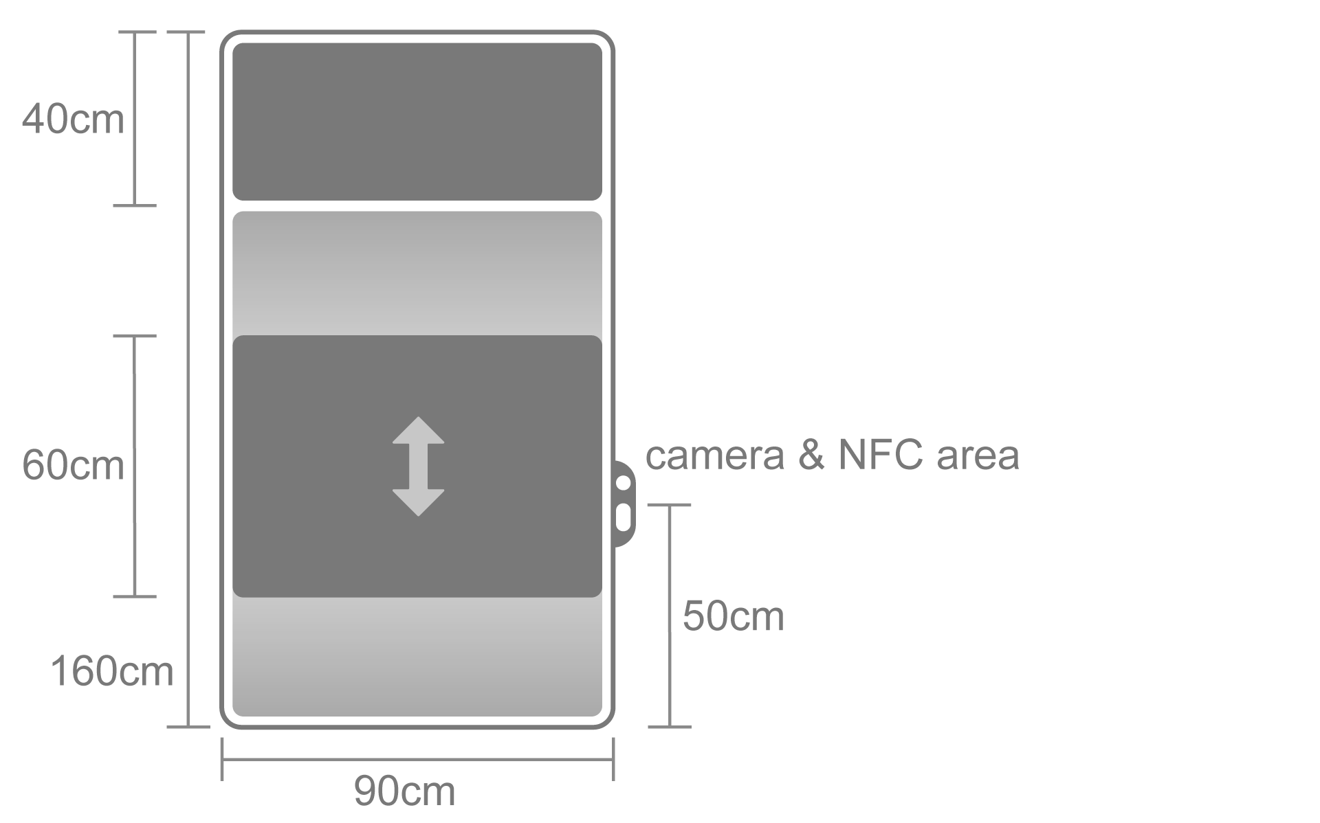
The height of the InterScreen is 160 and the width is 90 centimeters which corresponds to a 72,3 inch diagonal (figure 5). Therefore a 75 inch multi-touch display with a 16:9 aspect ratio is the right fit. The space between the bottom of the screen and the ground is 80 centimeters and can be achieved with a stand or wall mount. This means that the top quarter area is located in a height of 200 till 240 centimeters and can be seen from a greater distance even if a user interacts with the module. A smaller display without a top quarter area and a narrower interface is also possible. An InterScreen setup can consist of just one module or several modules in a combined row.
The height position of the user interface is adjusted automatically by an integrated camera which detects the users face in front of the InterScreen. A NFC (near field communication) is implemented an can be used for functions like verification or topping up a member card. (figure 5)
Interaction concept
Several different sample scenario are plausible:
- presentation field that narrows to the user interface when a person approaches closely (figure 6, module 1)
- user interface that is in use by a wheelchair user (figure 6, module 4), the position adjustment is triggered by the camera or manually
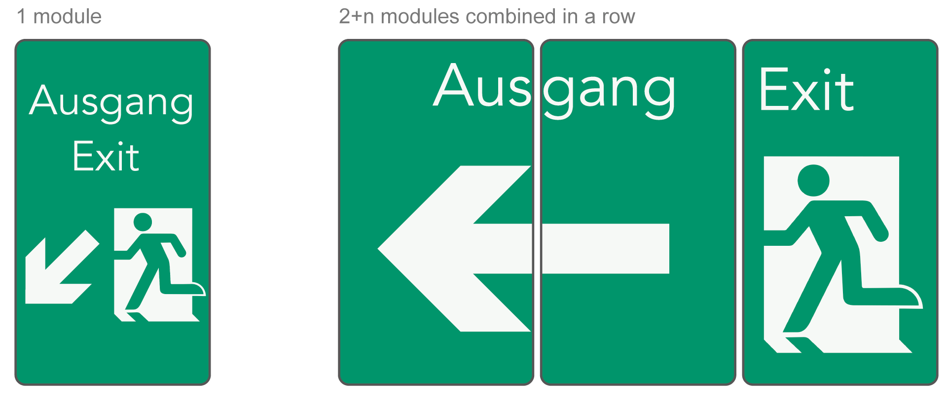
- emergency alert that functions as an exit sign (figure 7)

Interface concept
The wireframe of the user interface was primarily built for test purposes of the perceptual area (figure 8). There are two aspect ratios practical for the InterScreen:
- 16:9 with a size of 90x50 centimeters (40,7 inch diagonal)
- 3:2 with a size of 90x60 centimeters (42,6 inch diagonal)
Prototyping and evaluation overview
For the test setup was a wireframe click-dummy coded (figure 9, use Chrome or Firefox) and used as a Wizard-of-Oz-Prototyp. It was displayed in real size on a screen (figure 10) where the user was able to indicate an action that was than triggered by an operator on the computer. The purpose was to test effects like transitions. The overall concept was tested with a paper-prototype (figure 10).
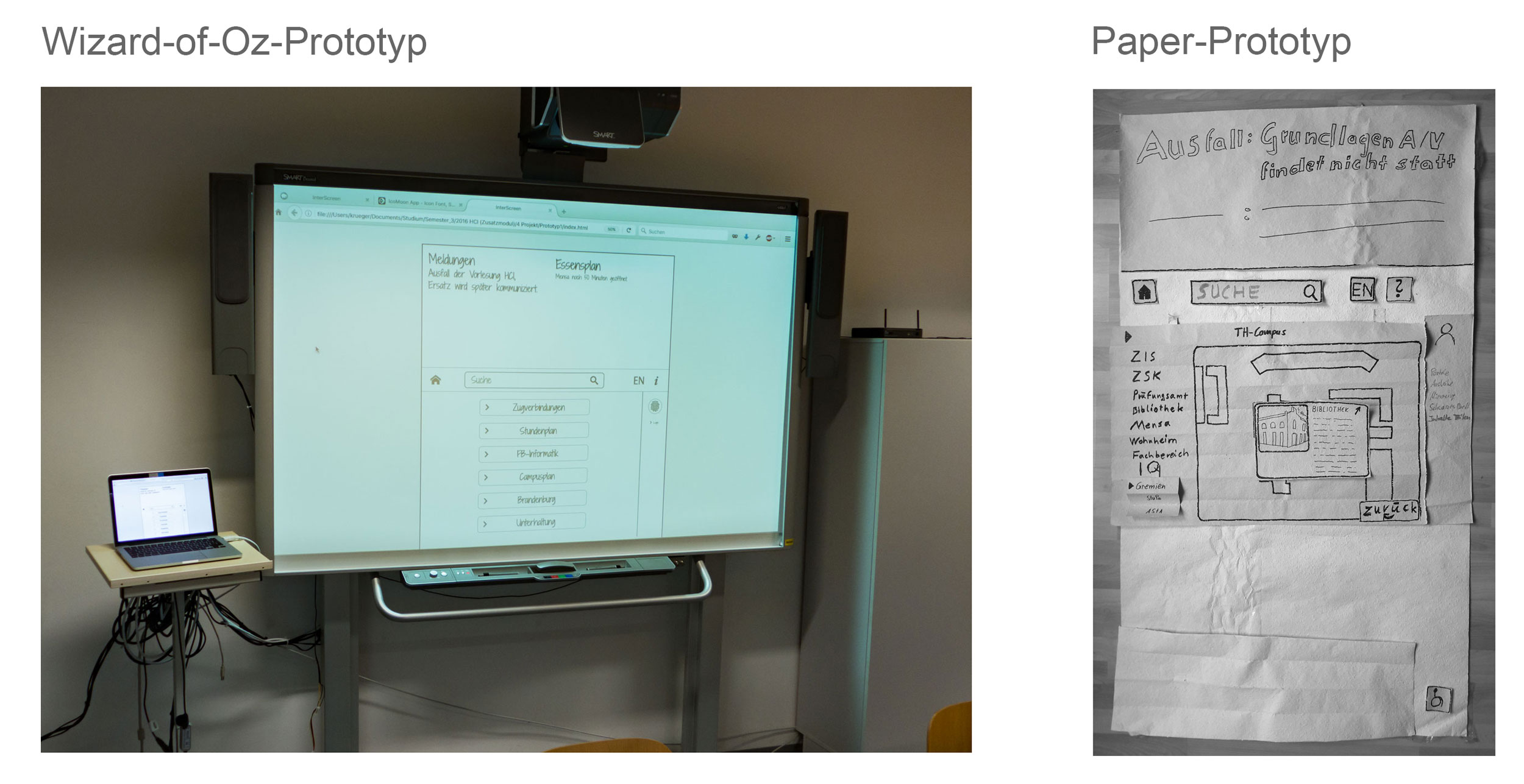
The click-dummy in figure 9 is a slight redesign compared to the click-dummy in figure 10, which was done based on the results of the usability test. An interesting result regardless of the InterScreen was that a paper-prototype seems to be more suitable for testing an concept than the digital counterpart.