Article
Cog-a11y 2/2 Concept
Concept for a complementary approach to personalization for cognitive accessibility and a test environment for affected users.
Idea
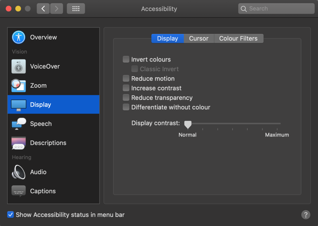
As the interviews showed, none of the test persons use an advertising blocker for their browser although advertising offers by far the greatest potential for distraction. Can it therefore be expected that affected people configure the system preferences of their operating system (figure 1)? Some test persons described that they don't need to set for instance a reduction of movement globally because they only would need it occasionally.
The idea is to offer on-demand view change, which would be an option in addition to those under development and limited to essential measures. By pressing a button the styling and even whole elements are exchanged just like the dark mode option that can be found on more and more websites. How such an alternative view would look like has to be determined by the website designer based on WCAG 2.1 requirements.
Technical concept
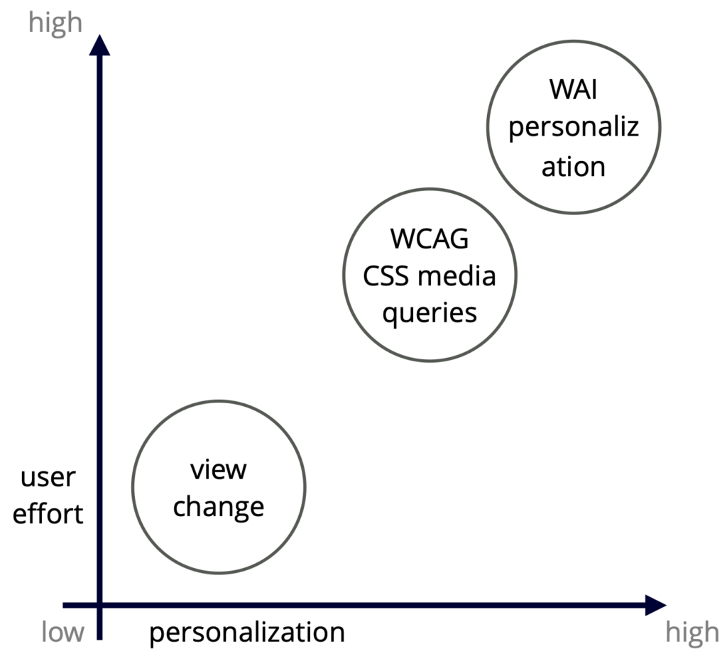
With libraries like react.js or frameworks like Angular an on-demand view change can be easily implemented through the component-based approach. Media queries level 5 can still be used for styling but in addition hole components are replaceable. Also the developed method of the WAI Personalization Task Force is not influenced by the concept because these three options complement each other. The user's effort to enable an accessibility method depens on the degree of personalization (figure 2).
For a successful implementation only existing guidelines and technologies have to be brought together. Therefore only a template is necessary as a reference and basis for other developers and designers. A react.js template sets default values in CSS and the basic functionality is demonstrated. After a user's action, necessary components will be replaced similar to how text manipulation works for multilingual pages.
Interaction concept
A user action for on-demand personalization/view changes is triggered simply by pressing a button (figure 3). It is just like changing to dark mode, simple language or higher contrast. The target group would not only consist of users affected by a cognitive disorder.
A website for instance that relies heavily on animation for its storytelling can provide this experience and still offer a low-animation version. Users can switch to this alternative view mode and continue to perform their tasks. It is imaginable that a manufacturer of a new lifestyle shoe presents the product in an extravagant way. Users with ADHD may be distracted so that they cannot find the information they are looking for, such as the materials from which the shoe is made.
Interface concept
Many aspects were determined by the requirements analysis. The test environment was therefore limited to the most important requirements. The following aspects were tested:
- user experience of the actual view change
- distractibility
- power of concentration
The interface needed to represent an ordinary website that can't be associated with any well known website. A single-page application was designed were requirements are handled in 6 differend sections (figure 4). Test environment: http://a11y.matthiaskrueger.info/


